


The art direction of Dead by Daylight follows the general idea of dark, grimy and savage design cues to give the game a feeling of horror, power, and desperation. The design team most likely took design cues from horror games and movies in order to drive in the feeling of a desolate and isolated vibe for the game. The game is based on a singular ÅgKillerÅh hunting down other survivors; when coupled with the designerÅfs vision for a game in the horror genre, most likely lent credence to their designs.
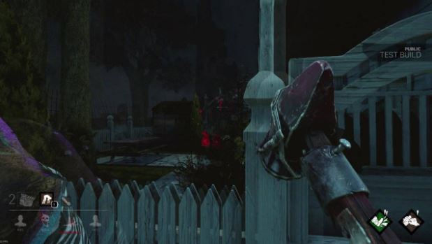
The game is set in third person for the survivors. Mechanically, this allows players to have a large field of vision so they are aware of their surroundings, something that is imperative in Dead by Daylight. Aesthetically, this exposes the player to the vulnerability of the survivor characters as they can now observe everything they perform and how they react to the situations that they are in. If someone is injured, stuck in a trap, or being carried away, the player is forced to look at their player character be in a disadvantaged state and, by proxy, feel the desperation and fear present within the characters in the game.
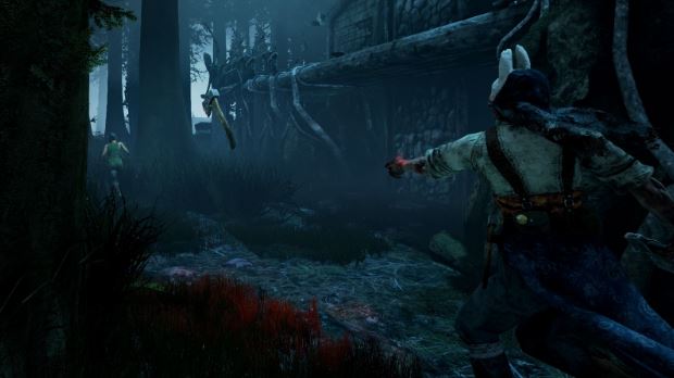
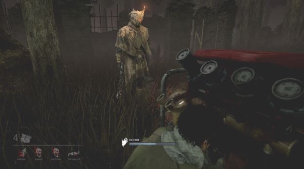
Those who play as the killers will play in the first person view. In the game, the killer can view tracks left behind survivors and having the game be in first person allows an immersive transition for allowing the monster to be able to observe them. The first person also gives the killer a slightly more narrow field of vision which supports the gameÅfs asymmetrical design, as the survivors have a third person camera. Aesthetically, the first person camera makes the player feel immersed as the killer when hunting down their targets. When dealing damage to players, the screen will often be covered in blood and the killer pauses to do an animation. The heavy swaying of the killerÅfs walking, skill-casting, attacking, and post-attacking animations exemplifies the power disparity present between the dominating killer and the desperate
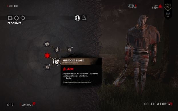
The UI in the games focuses a lot on dark colors, being black, red, green, yellow, and purple. The graphic design in the UI uses a lot of thick lines with tapering ends, simplistic yet crude icons, and vectors that look like blood splatters and the like. It is reminiscent of a savage, dark, and grimy feeling which is in tune with this game as a UI with a much more clean, colorful, thin, or streamlined art style for its menus and UI elements would create a visual dissonance with the dark tones behind the game. Despite the dark colors of the UI, character perks and abilities are colored in order to contrast against the heavy, rough, black lines utilized in the UI.
The colors used in the game rely on a lot of a lot of dark colors in its environment, usually coloring in desolate and abandoned areas in order to create a sense of fear, dread, and isolation. Locations in the game are rarely lit, if ever, allowing the lightning in each of the foreboding environments to exemplify the creepy atmosphere. The killers are designed to be imposing in stature with ethereal, yet human, traits. Wearing many tattered clothes and moving unnaturally lends to them posing a threat to the surviving team. However, the survivorsÅf character designs seem very normal and somewhat colorful compared to the killers, however due to the lighting of the game, clothes still appear dark and dreadful. The design of the survivors being quite normal helps emphasize the fact that they are just normal people trying to escape a deadly and terrifying situation.
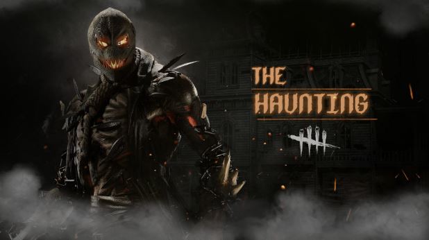
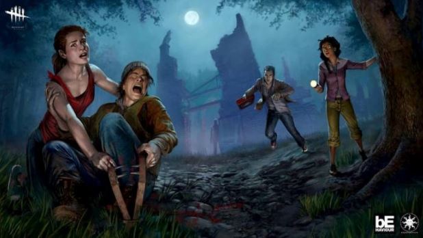
The survivors, killers, and environments have a realistic art style pertaining to their proportions, animations, and how they appear in different lightning. However, the survivors and the environment lean more towards the realistic side in order to emphasize the survivorÅfs vulnerability and establishes how particularly commonplace the maps in the game could appear in real life. Despite this, the killers lean more towards the exaggerated side of the spectrum of realistic, as they are deformed, deranged, and sometimes supernatural beings working for a higher being. This is exemplified through their imposing stature and savage-looking character designs and their walking, attacking, and spell casting animations in the game. The exaggeration of the killers helps in creating a disparity between the killers and survivors especially since the game functions as an asymmetrical multiplayer game (i.e. one strong player versus multiple weak characters).
The game accomplishes its goal of being a horror-based asymmetrical multiplayer game by how well put the art direction is in the game. The power disparity present between the imposing killer (with its design, POV, and animations rooted in the feeling of dominating, hunting, and power) and the vulnerable survivors (designs, POV, and animations rooted in normalcy, desperation for an escape, and being the prey) is executed incredibly well. The UI is stylishly dirty and blends in and enhances the grim atmosphere established within the game; if the gameÅfs UI had been more streamlined, curved, or clean, it would take away from the isolated and grimy atmosphere established by the environments in the game. Overall, the game manages to establish the horror-genre in this game incredibly well by how well pieced all of the art choices in the game were.